|
Flat wash- brushing strokes of color on a wet or dry surface.
Dry-brush- drawing or painting in which a brush having a small quantity of pigment or medium is applied to or dragged across a surface. Glazing- applying thin, transparent washes of one color over another color. Gradated wash- wash in which the value gradually changes from dark to light. Hue- a color's common name. Intensity- a color's saturation, brightness or strength. Lifting paint- removing paint from a surface with a brush. Masking fluid- liquid latex used to preserve the white of the paper and to create textures. Palette- surface on which watercolors are mixed and/or stored. Scrubbing- a dry-brush technique used to lift paint from or add color to an area of the surface. Color Temperature- level of warmth within any certain color. Tint- adding white to a pure hue. Shade- adding black to a pure hue. Transparent- a semi-translucent coat of paint that allows the dry under painting to appear as if through a mist. Value- a color's relative lightness or darkness. Wet-into-dry- paint that is applied to a dry surface. Wet-into-wet- painting on a wet surface. Wax resist- a water resistant medium is applied to dry paper before painting. Salt technique- salt is sprinkled on a wet wash. Watercolor paint- Pigments ground with a binder and diluted with water are applied in washes to white or light tinted papers. Blotting- removing paint. Watercolor paper- paper that is absorbent. Perspective- method of creating the illusion of depth.
0 Comments
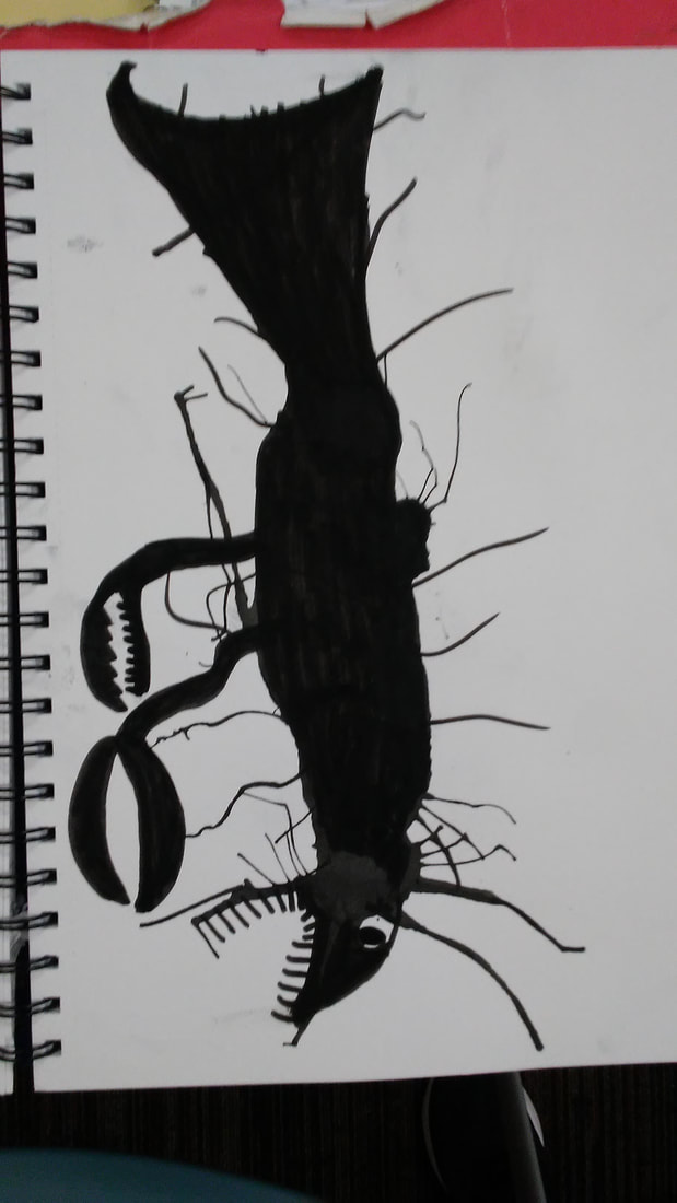
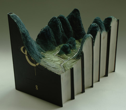
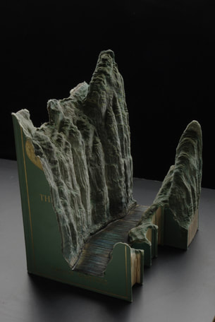
What I plan to do with my piece is to make it look like a grandfather clock. How I plan to finish it is to even out all the sides and finish putting it together. After that I will add the details to the piece. Then after it is fired I will paint it to look like a clock. The most difficult thing for me so far was trying to fix the mistake I made with the measurements of the shapes and sizes.It is difficult because it's taking me a while and it's hard to fix. The most successful thing for me so far is how the pieces came together well. What I did first was I got a big piece of clay and flattened it out using the wheel. I cut the clay into slabs using the fettling knife to get the top, base, and sides. After I finished the sides I used scratch and slip to attach the sides together. Before I attach the base and top I've been smoothing out all of the surfaces of the piece. I had to remake the base and top because they wouldn't support the weight of the piece because it was to small. Then when I finish the details and fire the piece I will paint it and it'll be a finished bisque pottery piece. 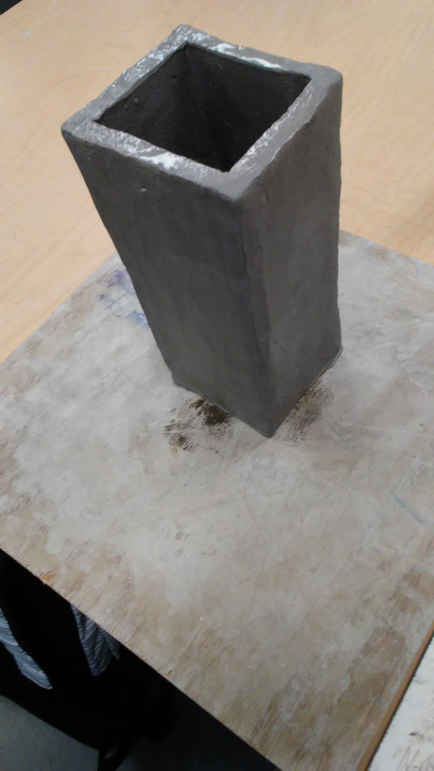 The place that is represented in my art is a concert that I went to a few weeks ago. The reason why this place is important to me is because I had a lot of fun there, it was the first time I went to one, and because I got to see one of my favorite bands in person. What I found to be most challenging about my picture was the fact that the colors in the picture were mostly blues and purples which made it hard to distinguish some things. What I feel was most successful about my piece was the majority of the colors matching the ones in the picture. my process in making my piece was starting with getting the background colors right, then painting in the screens and the stage. It took me a while to get the stage color I tried to go for. I added in some lights which also took me a long time to get the color. I tried to brighten up the screens where the light hit. Along the way I went over certain areas and at one point I added in a stage light that I thought made it way to messy looking. Finally I finished after I added in the drum set, microphone, etc. 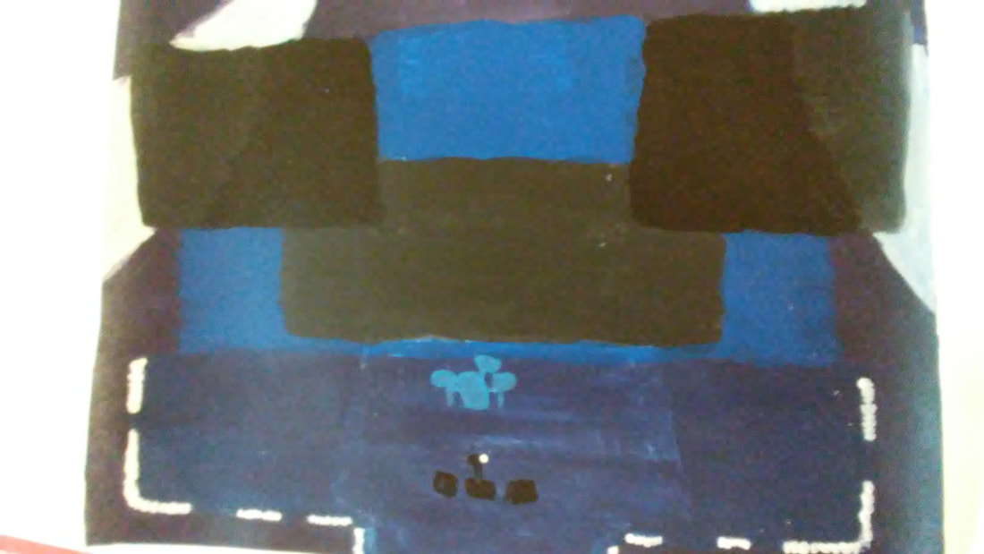 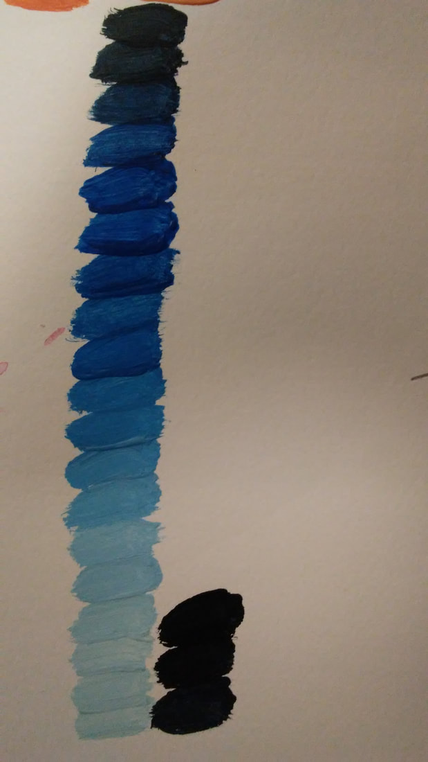 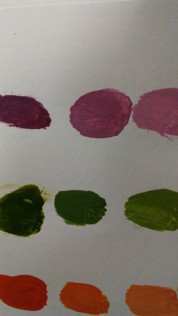 What I learned was how to tint, shade, and change the tone of paint color. The most helpful activity for the painting is Tint/Shade/Tone. The activity I learned the most from was color matching because it helped me learn contrast with colors. Three ways of mixing brown are mixing yellow, red and blue for the first one. Then yellow-green, red-violet, and red-orange to make another. Then the last one is green, red, and white. Also the way you would tone down a color is by adding black. 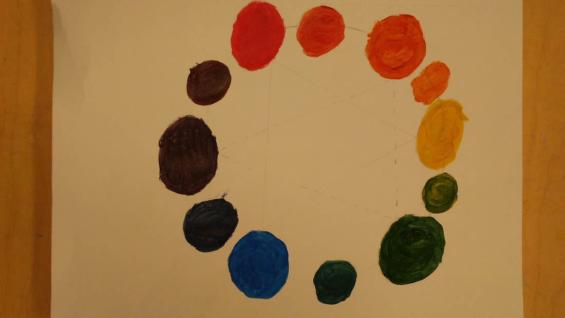 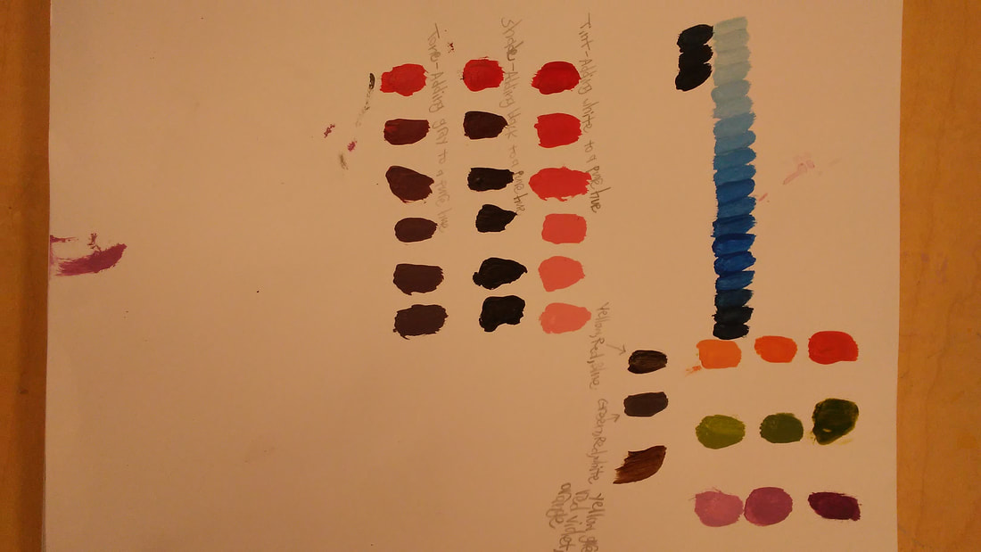   The most helpful warm-up during this unit was sign language B because that's when I thought about it being shapes and not a full hand which was very helpful and a great example to use for that very helpful technique. Value is the element of design that defines the lights and dark's in an artwork. Composition is the placement or arrangement of visual elements in an artwork. The pro for using pencils is that they are easy to use and erase but the con is that it's very easy to make it look scratchy. The pro for using pens is it's very useful with it's many helpful techniques but the con is the obvious one, you can't erase it. The pro for charcoal is if you make any mistakes you can just blend it back into the background if its also a shade of charcoal, and the con is it's very messy.  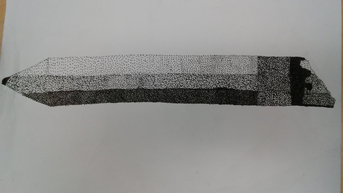  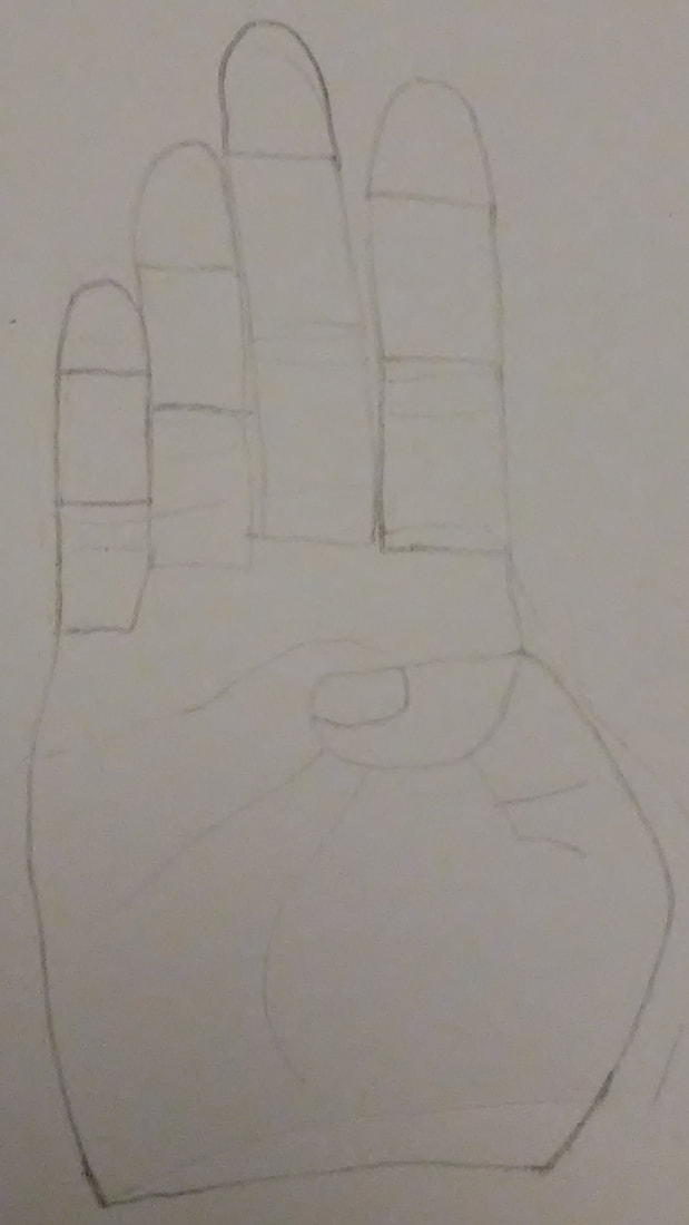 The artist I chose was the book carver artist Guy Laramee. He carves books to make very realistic landscapes. In his art he uses materials like bound stacks of old dictionaries, oil paints, inks, pigments, dry pastels, crayons, and adhesives. The reason why I chose him is because of how unique and realistic his art is. With the many types of landscapes and caves to look through. He inspires me to pay close attention to detail and to think outside the book. Before he was making art like this he was directing, working on literature, music composition, singing and many more! Until after he wrote several books he became interested in the field of anthropology. Which is where he came up with the crazy idea to carve landscapes into books. I found it really interesting that he did a lot of writing, literature, and sculpture because now I can see why he chose old books to choose to carve with. Some of his past exhibitions where at places like Quebec, Canada and New York, USA. His website is JHB Gallery.
|